I disagree with respect to Microsoft. Steve hated everything that worked but was ugly. Windows and Office had a brutalist beauty to it that you could fully customize if you desired to do so. Today with O365 and Azure it is a parody of its former design. Only after its default UI changed from 'dentist office' to 'parade of clowns with toasters' did everyone else decide they hated it.
I would argue that the Windows 95-2000 era SOTA application design, where Windows and Office arguably truly established themselves (and became highly customizable), was less brutalist than the preceding Windows 3.x design. Incidentally, the Steve Jobs quote is from an interview in 1995, so preceding that era.
Yes, WordPerfect and Lotus 123 were the top dogs until MS was finally able to eat into their sales. Office wasn't the king until '98 or even the 2000 version.
Borland's DOS IDEs represented what we might call brutalism in interface design. Windows (after 2000) arbitrarily became more like favelas with dozens of unnecessary panels in every application, a great example of when features win over rationality.
I just realized that I'm not sure if it's Borland or Norton who brought the blue interface to DOS first. Does someone remember who was first?
"I just realized that I'm not sure if it's Borland or Norton who brought the blue interface to DOS first."
Not sure about the blue color specifically but almost all the conventions came out of IBM's SAA and CUA initiatives. There is still a lot to find about these conventions and for some time in the early 90s every computer mag wrote about them. When I searched for the original IBM sources a while ago I could not find anything.
So, if anyone has a pointer to the original style guide I'd be very grateful.
"Borland's DOS IDEs represented what we might call brutalism in interface design."
Hmm, I think they could be perceived as brutalist nowadays because people are not aware of the technical restrictions these applications had to work with, but at least Turbo Pascal was a marvel of beauty at the time.
"Windows (after 2000) arbitrarily became more like favelas with dozens of unnecessary panels in every application, a great example of when features win over rationality."
I'd call it a slum. The Favela is X11 - poor by definition, yet charming in places, sometimes dangerous.
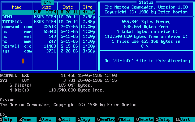
Norton Commander released its blue interface in 1986 (1), when Borland Pascal didn't have released something that had similarities with Norton Commander one year later in 1987, it was Borland Pascal 4.0 (2). And here is Pascal 3.0 for comparison (3).
UPD:
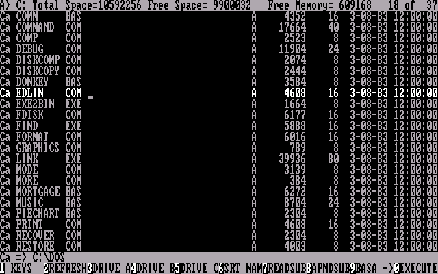
But now I'm not sure that it was NC first. Here is PathMinder (4) from 1984 and IBM FileCommand (5) 1983.
https://en.wikipedia.org/wiki/Brutalist_architecture